It was a typical enquiry.
"Can you design a roll up banner for us?
We have a couple of photos and our logo ready.""Sure, send them over and I'll take a look."
My hopes are never that high. Logo, photos and wording arrived promptly.
Vector Logo
To my surprise the logo was vector drawn - bonus! I usually get a tiny png file with a hefty dose of optimism. Scaling a 20mm image logo to fit a roll up banner never works out well.
A vector drawn logo is essential if you need to be able to scale it to any size without loss of quality. PNG & JPG files will lose quality as you attempt to increase their size. Vector drawn graphics such as EPS, SVG and possibly PDF never lose quality. (If you would like to understand the difference between file formats read our post Do you know your PNG from PDF? )
Your Logo is not enough
We are off to a good start with the logo, yet a logo is not enough. But I paid a designer top dollar (pound/euro) for my logo, what do you mean it's not enough?
A logo without a logo or brand implementation guide leaves me in the wilderness with how to use your logo in certain circumstances. What about its negative, or alternate colour ways. Are there any acceptable, or unacceptable, variations in placement, positioning?
Let me explain with my Digital Alchemist logo.
Logo Colourways
Do you know what colours that your logo and brand uses. I don't mean just grey, blue and white. I mean what is the RGB, CMYK colour codes of each colour.
You can see that my Digital Alchemist blue shade is RGB 0,92,156 and CMYK is 96,62,16,3.
Using a single colour blue was my original design concept, however, I was aware that this wouldn't be sufficient for all design requirements, especially when the logo is placed on a blue or dark background. And this is why the DA logo, brand development resulted in a palette of blue, grey, black & white and gives more options of contrast depending on the placement of different background colours.
Logo Variations
No matter how well your core logo is designed there are times it just doesn't fit the job. It's very common for people to want to use their logos on their social media profiles and the majority allow for a square or round profile images. Fitting a wide landscape logo into a circle is a challenge which is where logo variations come into play.
Here you can see options for the DA logo fitting into a circular profile image. Just shrinking the regular logo to fit may make it illegible, especially on mobile devices.
Logo Placement
It is also prudent to consider other positioning design restrictions with dos and don'ts of logo placements and configurations.
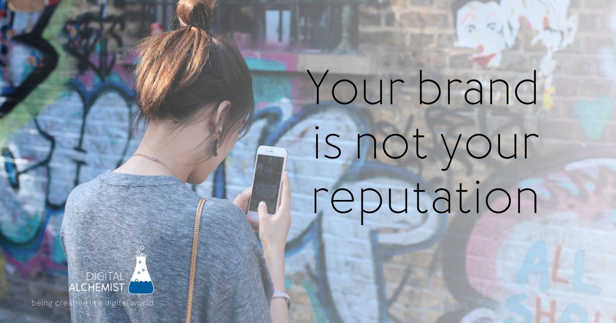
Your logo is not enough and it is not your brand
Whilst your logo may be a good starting point for your brand's identity, it is not your brand. I often tell people
Branding is painting pictures in other people's minds
Whilst your logo is like an artist's signature on their painting, your brand is manifested by the creation of your artistic masterpiece.
And as with all great artists they developed a signature style brought about by a consistency in their artistic thinking. By establishing a brand style guide it makes it much easier to develop a consistency with the pictures you paint in other people's minds.
If you need help with painting your masterpiece feel free to contact me @ https://digitalalchemist.live/contact/