Downloadable eBooks are an ever popular method for easily getting your content out there, whilst at the same time building your contact lists. They say you shouldn't judge a book by its cover, however, you don't get to see these covers before you've downloaded them. So it would seem you are going to judge the book by the book. If you are impressed, then you're most probably going remain happily subscribed to the mailing list that you have just joined. On the other hand, I recently downloaded a "9 steps to . . . ." from a big hitter in the social media world, only to receive a black and white single page of . . . let's call it scrap paper . . . well it was far from an eBook and I soon unsubscribed from the mailing list.
So you've worked out the content of your book and have your manuscript drafted in you Office app. Now the fun begins. Time to turn your chosen words into an attractive, engaging and informative eBook. Read on for my 5 top tips to creating your eBook masterpiece.
1: Page Size for your eBook
This is a simple tip. Portrait A4 - 210x297mm. Keeping it portrait, makes it an easy read on smartphones and tablets. The people who prefer to print it out to read or keep for future reference will thank you for designing it on A4. Told you it was simple.
2: Top Tip Titles
If you are going down the "5 Top Tips" road, or even 113 top tips (I never knew you could have 113 top tips but I saw one a few weeks ago) then break your document up with clear titles including the tip number. If each of your tips are going to nearly fill a page then start each tip on a new page.
3: Text Layout & Typography
When is the last time you read a newspaper or magazine, I mean a paper copy. Did you notice the text is presented in columns, rather than full page width. This makes it easier for the eye to scan and you to read. I'd suggest you take a leaf out of the traditional publishers book and do the same.
If you have a style or brand that uses specific typefaces then keep to them, otherwise select 2 or at most 3 fonts to work with. One for titles and headlines, one for the body text and a third, if you feel the need, for captions or pull quotes etc. And whatever fonts you choose, keep them readable; too many curls and swirls will make the eyes boggle.
4: Charts, Tables and Images
Here is a great excuse to break up the never ending lines of text. If your content calls for it, include relevant information in a chart or data table. It's a great way to provide a focused summary of what your words are taking about. Remember, informative and attractive.
Similarly they say a picture can paint a 1000 words, so include some pictures. However, be selective and creative in your choice of image. Also think about placement, size, angle and transparency. They can also be a great way to fill up too much white space on a page that has run out of words.
5: Call to Action - Contact Details
You've gone to a lot of trouble to produce your masterpiece and managed to figure out the web form to capture email addresses and provide the document download. So don't forget to include your contact details and a call to action. Typically this would be at the end of the book: "Email me with your questions", or "Call me know to book a free 20 minute consultation", or "Visit my website www. . .com for more information on . . .". It's that friendly reminder, the nudge to get the reader to take action to bring them deeper into your sales funnel.
You may also wish to include a footer on each page with your web address or other brand message.
Here's an eBook example
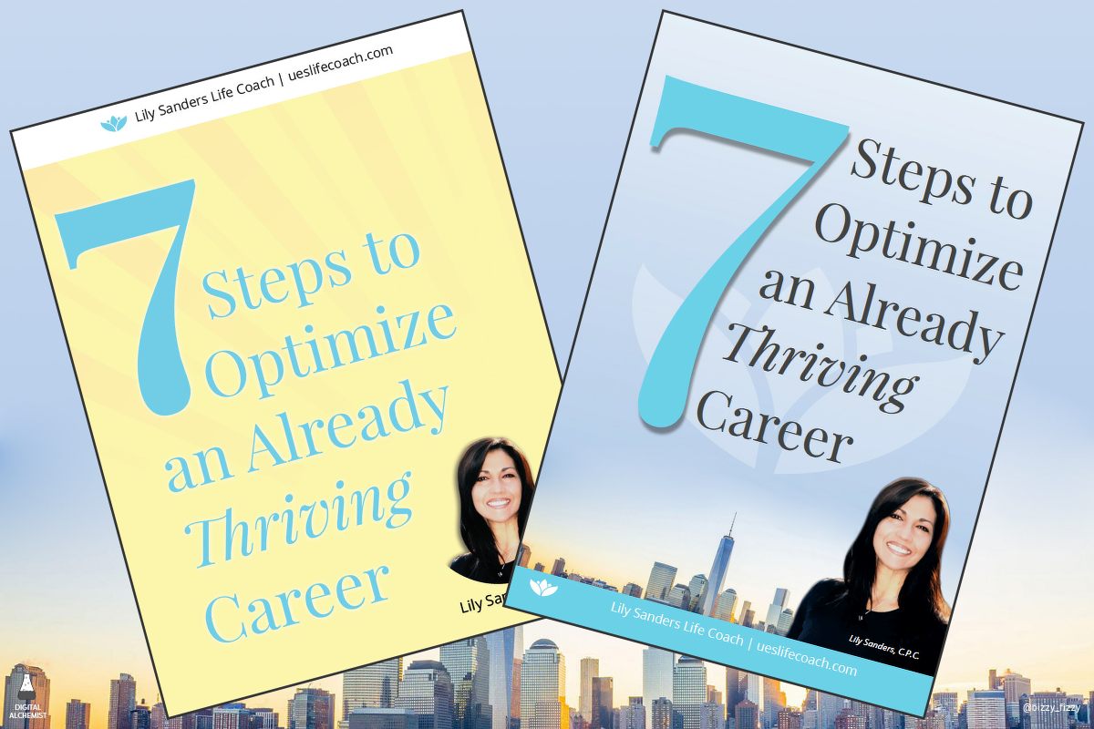
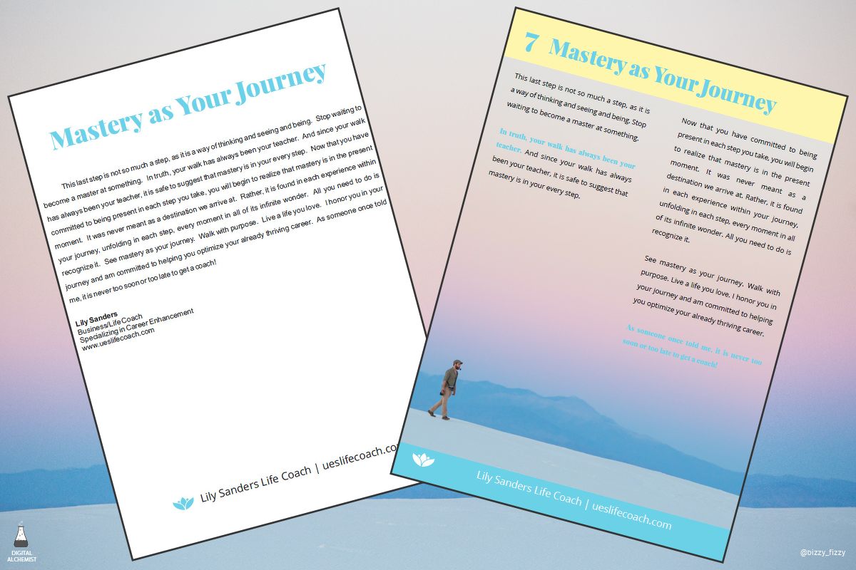
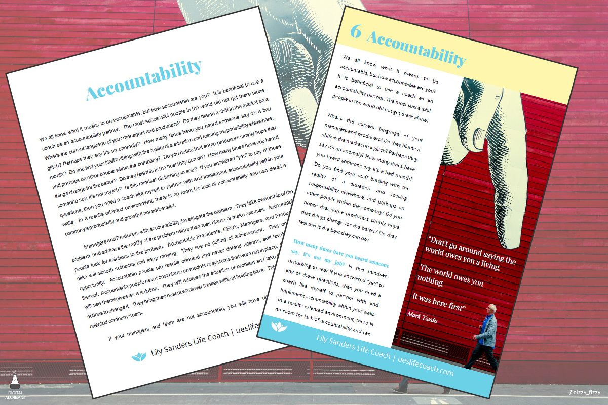
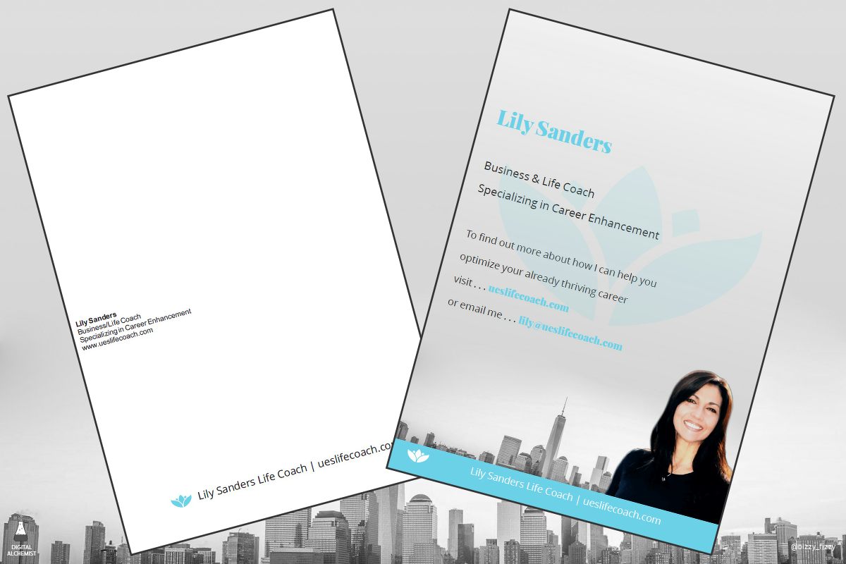
Here's some examples of a recent project where we were asked to work our digital magic on an existing eBook. Hopefully you'll be able to see the difference between the before and after.

Front cover design

Using a full page background image with two text columns

Creative use of image and pull quote

Final page with a gentle Call to Action
and if you'd like to see a completed eBook - you can download a copy from Lily Sanders Life Coaching site
