I hate roll up banners! Just another job on the tick list of presenting yourself, or a business, at a trade exhibition or fair. Well on reflection, it’s not the banners I hate, moreover, it’s the lack of thought and creativity that goes into their design.
There are a few popular mistakes that people make time and time again. Let’s delve into the detail . . .
Less is more
Let’s face it, roll up banners are a large sheet to fill and on a computer screen. It’s a large canvas to fill when compared to the more typical work of designing business cards and A5 leaflets. So with lots of space to fill there becomes an overwhelming desire to include a heavily loaded, comprehensive list of products and services.
Remember, people don’t have the attention span to want to stop and read too much detail. Initially, people don’t want to get too close in case they are pounced upon by an overzealous salesperson. A quick glance should capture their attention and invite them to engage in conversation.
Less is more, grab attention with headlines rather than endless detail. You can save the detail for promotional leaflets, booklets etc.
Go big or go home
It can be difficult when designing on screen to relate to the finished printed size of your typefaces and it is easy to fall into the trap of being too small to be easily legible from a distance. Remember, people don’t want to be up close and commit to engaging with you before they know what you and your banner are all about.
Go big and be bold with typography. Ask yourself if you can still read it 5 or so paces away.
Don’t hide under your table
It still amazes me how many people fall for this design disaster. Your busy designing your banner on screen, start at the top and work down, logo, headline, picture, oh and let’s not forget contact details, phone, fax, email, address and all the social media account names, and website address . . . .! Yup, all those contact details end up at the bottom of the banner. And yes it looks great on screen and fine when you have it in your office for everyone to admire.
The reality goes like this: you turn up at your exhibition space and erect it at the back of your stand, unload those boxes of leaflets which you stack behind the chair that you sit on in front of the table. You’ve just realised that no one will ever see your contact details hidden behind all that lot.
Keep key contact details on the top half of the banner. And again, less is more. Keep it to a minimum with just a web address, phone number and geographical location (if that’s important to your business). There is no need to print all of your contact details.
By all means, include social media icons so people are aware that you are on Facebook, Twitter, Linkedin etc but keeping it simple by pointing them to a webpage will suffice and the page can then allow them to continue on to find out more information about you and your business. You could use the special domain name to direct to an exhibition specific landing page.
Be brave with your design
Exhibitions are visually busy environments, attention spans shrink and minds close. You need to grab attention, make people open their eyes and minds.
You need to stop them in their tracks.
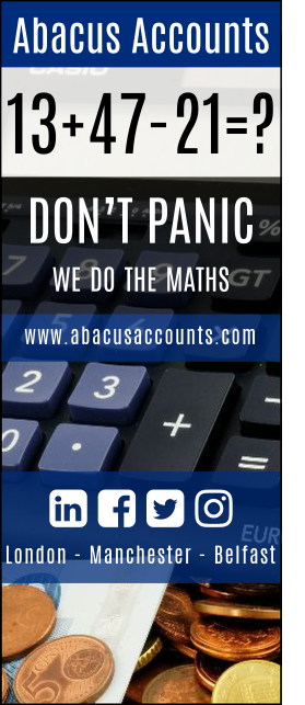
Let's look at an example; Abacus Accountants are as you may have guest a firm of accountants.

Be Boring
You’ve got the hang of Abacus Accountants after “Accountants Who Care”.
It’s no surprise they do accounts, vat, tax, bookkeeping but few will ever read all of that text because they are stating the obvious. Are there any accountants that don’t do accounts, tax and bookkeeping? Are you inspired or bored by this background noise? I'm sure if you look close enough you can take a note of their Fax number.
Be Brave
Taking a different perspective, a braver perspective.
13+47-21=?
Don’t Panic,
we do the maths
It’s eloquently simple, it catches the eye and sparks a sense of genius in the mind. You’ve just stood out from the crowd and the ice is broken. These are not dull, boring accountants.

If you need help with the design and printing of Roll Up Banners we'd be delighted to add some of our creativity to your requirements.
Not only do we design roller banners, we can print them for you too.
.


